Graphing

(This help is also available inside Numerari.)
Numerari makes it easy to generate function graphs on rectangular and polar grids. You can use the default linear scales for the graph axes or you can select logarithmic scales to create log-linear, linear-log, and log-log graphs. Special decibel scales are also available for additional engineering and scientific applications.
Graphs are specified in the build display using forms with fill-in blanks and option buttons. The "Graph" key brings up the graph keypad at the top of the history display. On the graph keypad, the "y(x) Graph" key creates a form for a graph using a rectangular grid and the "r(θ) Graph" key creates a form for a graph using a polar grid. Blanks in the forms are for required items that must be filled in with expressions and the buttons are for controlling options like colors and scales. Move around the forms with the regular cursor controls you use in the build display, but remember that you can also tap a blank to move the cursor there directly.

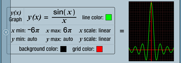
The first blank in the y(x) form should be filled in with the expression for the function you want to graph. You create this expression just like any other expression in the build display except that you use the "x variable" key to insert the x that varies in the graph. The only other form requirement is to specify the initial range for x. This can just be an estimate since you can pan and zoom the graph when it appears.

Note that an x min or x max limit can be any expression that evaluates to a real number. The function expression does not have to evaluate to a real number everywhere, but graph points will only be shown where it does. That is, y(x) can be a complex number or invalid in various regions of the graph but nothing will be drawn there. The advanced functions for absolute value, complex argument, real part, and imaginary part are useful for graphing expressions that yield complex numbers.
Once the blanks in a graph form are filled in and you have set any options you want to change, tap the equals key and a full screen window will open with the graph. You can bring up the "Done" button to close the window by single tapping. The labels on the graph are formatted using the same number formatting choices you have made in the settings. For example, if you want all the labels formatted in scientific notation, just choose that number formatting option and generate the graph.

Numerari tries to place few restrictions on the kind of graph you can draw, but note that certain anomalous functions that generate an enormous amount of rapid graph changes can take several minutes or longer to generate. This is because Numerari does a lot of analysis to give you the best graphs of normal functions. Graphs with large invalid regions are also slower to draw as Numerari searches very hard to find any valid points in the invalid regions.
After you close the full screen window, a copy of the form and a thumbnail of the graph are inserted into the history. Just like any expression in the history, you can copy the form back to the build display for editing with just a tap. The expressions inside of a form in the history window can also be tapped and copied to other forms or expressions in the build display. In addition, you can tap the graph thumbnail to open the graph in a full screen window.

Since tapping the form title copies the entire form to the build display, touching and holding the form title allows you to drag an entire form to a user-defined key and save it. You can save a completed form from the history or a partially completed form from the build display. Although it is not possible to clearly see the form on the small user-defined key, some keys like this could still be useful for saving forms with your favorite option settings.
The previous graph example left the y min and y max limits set to auto. This tells Numerari to try to choose appropriate limits. If the graph is bounded, i.e., contained in some vertical region, then Numerari sets the limits to that region. If the graph is unbounded as in the previous graph example, then Numerari tries to remove "uninteresting" parts of the graph. However, you can set the y limits manually to get exactly what you what. Just tap one or both of the y limit buttons to switch a limit from auto to a blank. Then fill in the blank with an expression. If either y limit is left as auto, then Numerari will choose that value.

Below is a history entry with the y limits set to show a specific region.

You can change the line, background, and grid colors by just tapping the form button next to the color swatches and choosing a new color from the menu.

The color menu closes automatically when you choose a color (or you can tap the button again or tap anywhere outside the menu). Below is a history entry for some high contrast colors.
You can graph multiple functions at the same time by just tapping the "add function" button. This inserts another function line with a blank for the new function expression.

Below is a history entry for a graph with three Bessel functions (from the advanced functions keypad).

Numerari has a variety of different scales to choose from for labeling an axis. The x and y scale menus are shown below. There are two linear scales (regular linear and pi linear) and three logarithmic scales (regular logarithmic and two decibel scales).

The regular linear scale is sufficient for most graphs but Numerari also includes the pi linear scale which labels an axis in multiples of pi. This is useful for functions with behavior that depends on pi such as the tan(x) function below.

Logarithmic scales allow a graph to show function details over a wide range—from very small to very large. The graphs below illustrate the four combinations of the regular linear and logarithmic scales. Note that a linear scale has its origin at zero and a logarithmic scale has its origin at one.

A unique and powerful feature of Numerari is that the expressions used in graph forms can include units and constants just like any other expression you use in calculations. Below is a graph form for the magnetic flux density along the x axis between two wires on the y axis.
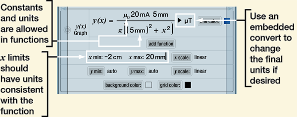
The resulting graph below shows the units at the ends of the axes. Note that if the units for the x min and x max limits differ, the x min units are used.

The best place for the x variable units is on the x min and x max limits as shown in this example. That way, the units show on the graph at the end of the x axis. It would be possible to leave the units off the x min and x max limits and place them on the x variable in the function expression. The graph would look the same but there would be no units on the x axis. However, do not place the units on both the limits and the x variable in the function expression.
Note that when the radian/degree mode is set to "DEG", if you specify variable limits without units and the variables appear in trigonometric functions that expect an angle, Numerari will treat the variable value as degrees. In the history display, it will add degree units to the variable in the function expression to show that its value was interpreted as degrees. Do not reuse that form later and add degree units to the variable limits because this would result in the degree conversion being applied twice.
If one or both of the y limits are set, the units on these limits supersede the units on the function and they are the units shown on the graph for the y axis. Of course, these y limit units must be consistent with the function units, and the function values are automatically converted from the function units to the y limit units. If the units for the y min and y max limits differ, the y min units are used. The history entry below shows y min and y max limits that zoom in on a region of the graph as well as make the embedded conversion in the previous form unnecessary.

If you are graphing multiple functions, the function expressions can have different units but they must all be consistent (for example, they must be all lengths, all masses, etc.). The units shown on the y axis will be the y limit units if the y limits exist and will be the units of the first function otherwise.
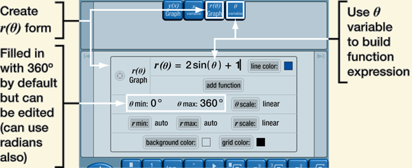
Creating graphs with polar grids is very similar to how you create graphs with rectangular grids. As shown below, create the polar graph form and build the function expression with the θ variable. By default, the θ limits are set to 0° and 360° to give a full revolution, but you can edit these to graph only part of a revolution or to graph more than one revolution (for spirals). You can also specify the range in radians; for example, 0 to 2pi specifies one revolution (as long as the radian/degree mode is set to "RAD" or you include radian units in the limits). You can even use negative θ limits (but the θ labeling will always show the polar axis at zero). In addition to helping to set the initial region to display, the r limits restrict the graph to just those points that are between the r min and r max.
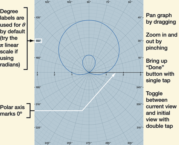
When you tap equals, you will get a full screen display of the graph that you can pan and zoom. The zooming for polar graphs is always proportional so that the circular grid remains circular.
For polar graphs, the θ limits can have either no units (which is treated as radians if the radian/degree mode is set to "RAD" and degrees if the mode is set to "DEG") or only angular units (rad, degrees, etc.); otherwise, working with units is the same as before.